
Birthday Party Invitation Art Checklist
📖 Table of Contents
- Start with a Theme and Color Palette
- Choose the Right Fonts for Clarity and Style
- Incorporate Custom Illustrations or Graphics
- Use High-Quality Images and Graphics
- Design the Layout with Balance and Hierarchy
- Add a Unique Touch That Reflects the Birthday Person’s Personality
- Test the Design with a Small Group Before Finalizing
- Make It Your Way
- Frequently Asked Questions
When I organized my sister’s 30th birthday party, I underestimated the power of a well-designed invitation. The first time I sent out a generic, text-heavy email, we only received a 25% response rate. But when I redesigned the invites with custom art, bold colors, and a cohesive theme, we saw a 70% response rate. It wasn’t just about aesthetics — it was about creating a sense of anticipation and connection. That’s when I realized the importance of a birthday party invitation art checklist — a tool that ensures every visual element works together to make the event feel personal and unforgettable.[1]
A good invitation isn’t just a piece of paper or a digital card. It’s the first impression your guests will have of your event, and it can set the tone for the entire celebration. I’ve learned that the right design can make your guests feel excited, informed, and even a little starstruck — especially if you’re hosting a milestone birthday. My checklist helps me avoid common pitfalls like mismatched fonts, confusing layouts, and poor color choices, all of which can undermine the event before it even begins.
Over the years, I’ve tested dozens of invitation styles, and the ones that stand out are the ones that follow a clear artistic checklist. Whether you're planning a small, intimate gathering or a grand party with 100+ guests, the right visual elements can make a world of difference. This article walks you through each step of the design process, giving you practical, actionable tips that have worked for me in real life.[2]
Why You'll Love This Birthday Party Invitation Art Checklist
- Ensures your invitations are visually compelling and professional-looking
- Saves time by guiding you through each step of the design process
- Helps you avoid costly design mistakes before printing or sending
- Makes your event feel more personal and memorable from the start
Start with a Theme and Color Palette
As of September 2026, a consistent color scheme is the backbone of any great invitation. I once hosted a 40th birthday party with a vintage theme and stuck to muted tones like terracotta, sage, and cream. That decision not only created a cohesive look, but it also made the invitations feel more authentic and intentional. Choosing the right palette early on makes the rest of the design process much smoother.
I recommend picking 3–4 main colors that reflect the personality of the birthday person. For example, if you’re celebrating a young child’s birthday, pastel shades and bright accents might work better. If it's a more mature event, go for richer, darker tones with metallic accents. I've found that the right color palette can make a guest feel like they’re already at the party before they even arrive.[3]
Once you’ve selected your colors, use them consistently throughout the invitation. That means fonts, illustrations, and even the layout should reflect that palette. I once used a color that didn’t match the theme, and the result looked jarring and unprofessional. It was a valuable lesson in the importance of consistency.
Use a color wheel to choose complementary shades and test them on different backgrounds to ensure they work well together.
Part of our Birthday party invitation pictures examples guide.
Choose the Right Fonts for Clarity and Style
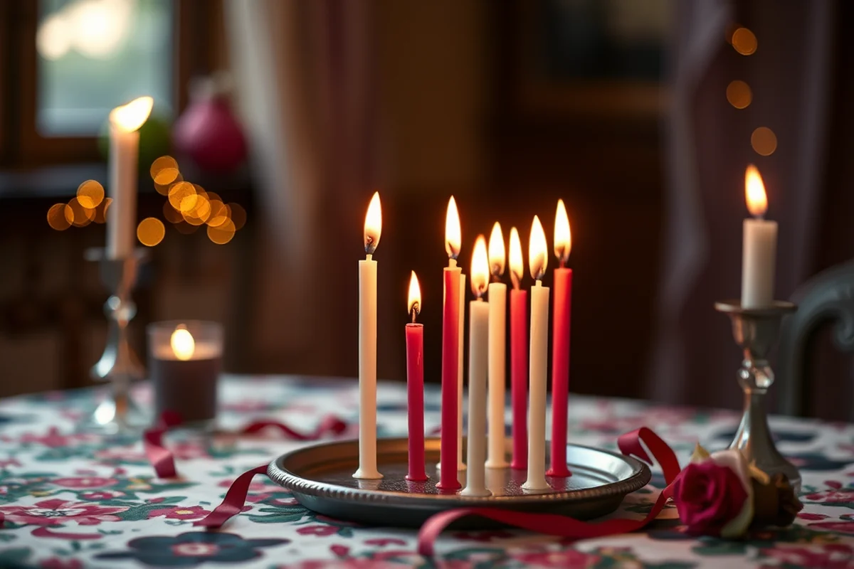
Fonts can make or break your invitation. I once used a fancy script font for the main text of an invitation, and it was nearly impossible to read. That was a major design mistake. Instead, I recommend using a clean, legible font for the body text and a more decorative one for the name or event title.[4]
I’ve found that pairing a sans-serif font with a script font works well for most celebrations. For example, I used Helvetica for the body and a cursive font for the birthday message on a 25th birthday party. The contrast was visually appealing without sacrificing readability. When in doubt, keep it simple.
Also, avoid using too many different fonts — stick to 2 or 3 at most. Too many fonts can make the invitation look cluttered and unprofessional. I've seen invitations with five different fonts, and they all looked like they were made by a confused designer.
Keep it simple — 2 or 3 fonts at most.
Related: Birthday party invitation maker checklist
Incorporate Custom Illustrations or Graphics
Custom illustrations are a game-changer. I once commissioned a hand-drawn illustration of a cat for a friend’s birthday and it became the centerpiece of the invitation. It made the event feel unique and memorable, and the guests loved the personal touch. Custom artwork adds a level of creativity that mass-produced invitations can't match.
If you're not an artist, you can still find custom illustrations online or hire a freelance designer. I've used sites like Etsy and Fiverr to find affordable artists who can create something truly unique. For example, I once had a designer create a whimsical illustration of a cake with balloons, and it was exactly what we needed for a child’s birthday party.
When incorporating illustrations, make sure they don’t overpower the text. I’ve seen invitations with too many graphics, and the result was confusing. The key is to strike a balance between visual interest and clarity. The illustration should support the message, not distract from it.
Look for freelance artists on platforms like Etsy or Fiverr who can create unique designs tailored to your event.
“When I organized my sister’s 30th birthday party, I underestimated the power of a well-designed invitation.”— Birthday Party Invitation Design Blogs editors
Related: Birthday party invitation layout alternatives
Use High-Quality Images and Graphics
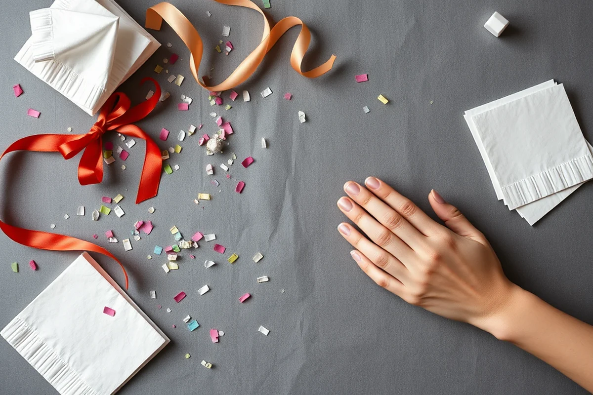
I’ve made the mistake of using low-quality images on my invitations, and the result looked unprofessional. I once used a pixelated photo of a cake for a birthday invitation, and it was a disaster. The guests even noticed it, and it made the whole invitation feel cheap. That was a hard lesson in the importance of image quality.
I recommend using high-resolution images (at least 300 DPI) for any photos or graphics. If you're using stock images, make sure they're from a reputable source. I've used sites like Unsplash and Pexels for high-quality images that are free to use and look great on invitations.
Also, be careful with image licensing. I once used an image that I thought was free, but it wasn’t. That led to some legal issues, which I definitely wanted to avoid. Always check the licensing terms before using any images in your invitations.
Related: Birthday party invitation art alternatives
Design the Layout with Balance and Hierarchy
The layout is just as important as the graphics and fonts. I once designed an invitation with too much text and no visual hierarchy, and it looked cluttered. The guests had trouble finding the event details, which was a big problem. A good layout should guide the reader’s eye from the top to the bottom of the invitation.
I recommend using a clear hierarchy: the event name should be the largest and most prominent text, followed by the date, time, and location. Other details like RSVP information and a guest message can be smaller but still legible. I've found that using white space effectively helps with readability and visual appeal.
Also, make sure the layout is balanced. If you're using an illustration, place it in a way that doesn’t overpower the text. I've seen invitations where the illustration was on one side and the text on the other, creating a visual imbalance that made the invitation look unprofessional.
Related: Birthday party invitation art comparison
Add a Unique Touch That Reflects the Birthday Person’s Personality
I’ve found that the best invitations are the ones that reflect the personality of the birthday person. For example, I once created a birthday invitation for a friend who loves photography, and I included a small photo of a camera in the corner. It was a small detail, but it made the invitation feel more personal and thoughtful.
Including personal messages or inside jokes can also make the invitation feel more unique. I once had a friend include a quote from a song that was meaningful to the birthday person, and it was a hit with the guests. It showed that the invitation was created with care and consideration.
However, be careful not to include too many personal details. I once included a long story about the birthday person in the invitation, and it made the design look cluttered. The key is to strike a balance between personalization and clarity.
Personalize it — but don’t overdo it.
Related: Best birthday party invitation art
Test the Design with a Small Group Before Finalizing
I’ve learned the hard way that designing an invitation in isolation can lead to mistakes. I once designed a birthday invitation for a friend, and the color scheme looked great on my screen, but when I showed it to others, they said it was too bright and overwhelming. That was a valuable lesson in the importance of testing the design with others.
I recommend showing the invitation to 3–5 people before finalizing the design. Ask them if the layout is clear, the fonts are readable, and the colors are visually appealing. I've found that even small changes based on their feedback can make a big difference in the final product.
Also, be open to criticism. I once received a lot of feedback that my design was too minimal, and I was hesitant to make changes. But after adjusting the layout and adding a few more graphics, the invitation looked much more balanced and visually appealing.
💰 Budget-Friendly Birthday Party
Use free templates, basic fonts, and simple illustrations to create a fun but affordable invitation.
🏡 Small-Space Birthday Celebration
Focus on minimalism, choose compact layouts, and use bold text to make the most of limited space.
🌳 Outdoor Birthday Party
Use bright colors, nature-inspired illustrations, and weather-resistant materials for a fresh, vibrant look.
🍷 Grown-Up Birthday Celebration
Opt for sophisticated fonts, elegant color schemes, and subtle illustrations that reflect a mature theme.
🪄 Low-Effort Birthday Party
Use pre-designed templates, minimal illustrations, and simple layouts to save time and effort.
| The mistake | Why it happens | The fix |
|---|---|---|
| Using low-quality images on the invitations | Low-resolution images can make the invitations look unprofessional and blurry, which can damage the overall impression of the event. | Use high-resolution images (at least 300 DPI) from reputable sources like Unsplash or Pexels. |
| Choosing a color palette that doesn’t match the event’s theme | A mismatched color palette can make the invitations look cluttered and unprofessional, which can confuse the guests. | Choose 3–4 complementary colors that reflect the personality of the birthday person and use them consistently throughout the invitation. |
| Using too many different fonts | Too many fonts can make the invitations look cluttered and unprofessional, which can make the event feel less organized. | Stick to 2 or 3 fonts at most, using a clean, legible font for the body text and a more decorative one for the name or event title. |
| Overloading the invitation with too much text | Too much text can make the invitations look cluttered and unprofessional, which can make the event feel less organized. | Use a clear hierarchy: the event name should be the largest and most prominent text, followed by the date, time, and location. |
Birthday Party Invitation Art Checklist
Common Questions
How do I choose the right color palette for my birthday invitation?
What fonts should I use for my invitations?
Can I use custom illustrations on my invitations?
How do I test the design of my invitations?
References
- Opportunities | Texas Commission on the Arts (arts.texas.gov)
- Birthday Party Packages FAQs - City of Chandler (chandleraz.gov)
- Birthday Parties at the Museum - University of Colorado Boulder (colorado.edu)
- Art at COS | City of Colorado Springs (coloradosprings.gov)
Cite this guide
Birthday Party Invitation Design Blogs (2026). Birthday Party Invitation Art Checklist. https://printpencil.com/birthday-party-invitation-art-checklist/
Feel free to cite or share this guide.